 Blog • View all / All /
  Insights
Dmexco marked a new chapter in Sublime (Skinz) story – an exciting rebrand, the 4th company I rebranded during my career!
Behind a rebranding, there is always something else than a new logo or a new corporate identity: a rebranding must include company values, but also past and future projects. This is why my team have worked tirelessly behind the scenes to ensure a new identity truly reflects those.
Name, brand, tagline, and website have all been given a refresh, and these changes serve to reflect the impressive development of Sublime since its 2012 inception. However, while we may now look different, our commitment to enhancing the user experience and offering innovative solutions in a fast-evolving and demanding industry remains the same.
A fresh perspective
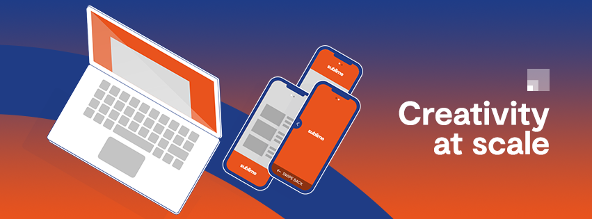
Our logo has been redesigned in a clean, chunky, modern font – not only more impactful, but also reflective of our forward-thinking approach to advertising. Look closely, and you’ll also notice the ‘M’ has been created to represent the arches of the wallpapers that sit at the very heart of Sublime's offering. It can also reflect the "Arc de Triomphe", in reference to a French based company. The three overlapping squares, which sit behind the text, are also significant – indicative of creativity, deployment, and platforms – a trio of components intrinsic to the company. The new tagline, ‘Creativity at Scale’, conveys impressive capability to deliver high-impact ad units in brand-safe environments – which we recognise as being two factors of upmost importance to our partners. Meanwhile, our new brand colours are a striking orange and blue: the aforementioned is a continuation from Sublime’s prior branding but has been revived with a fresh tone; while the introduction of blue is thanks to the hue’s association with the tech market.
At full strength
It’s not just our external messaging that’s had a makeover – we’ve decided to shake things up a bit internally, too . Previously, Sublime’s focus was primarily on selling ad formats – but now, we provide clients with a more rounded, rich branded experience. We’ll continue to provide advertisers and publishers across the globe with innovative, tailor-made solutions at scale, and leverage our proprietary technology to respect the user experience, serve KPIs to brands, offer higher engagement, and guarantee viewability. Overall, the rebrand reflects the company's unique approach and the unrivalled creativity that we offer our clients, and will help ensure Sublime stands out and achieves deserved recognition within the advertising marketplace. In conclusion, a rebranding is something more than just a fresh look and messaging: a rebranding reflects the next stage in a company journey.


